
データビジュアライゼーション
ロリポップグラフとは、上記のようなグラフです。棒グラフのバーを、キャンディーのような形にします。項目数がおおい場合に、棒グラフより見やすくなります。
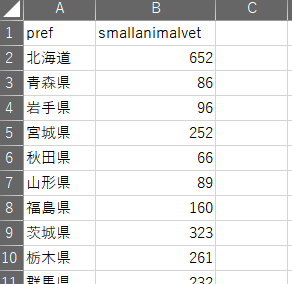
使用データ
今回つかうデータは、農林水産省の獣医師の届出状況を使います。2019年12月のデータです。
https://www.maff.go.jp/j/tokei/kouhyou/animal/index.html
エクセルで集計します。
通常の棒グラフ
ロリポップと比較するために、普通のbar chartを作成します。ggplotで使って作ってみます。
まずはデータの読み込みと、日本語フォントの設定と、ggplotのラベル順番のサポート列を作成します。
library(tidyverse)
windowsFonts(meiryo = windowsFont("Meiryo UI"))

df <- read.csv("small_animal.csv", colClasses=c("character","numeric"))
df$smallanimalvet <- as.numeric(df$smallanimalvet)
df$n <- 47:1
ggplotの棒グラフで、coord_flipしてy軸にラベルを持ってくると、上から順番にならんでほしいのに、下から順番に並んでしまい逆になってしまいます。そのためのサポート列nを作成しています。
そのあとは、ggplotで描写します。reorderを使って順番を変えています。dplyrのarrangeで順番変えても、ggplotでは効きません。ggplot内では、reorderを使う必要があります。
ggplot(df, aes(x = reorder(pref,n), y = smallanimalvet, fill=n))+
  geom_bar(stat = "identity") +
  scale_y_continuous(limits=c(0,3000),expand = c(0, 0))+
  coord_flip()+
  xlab("")+
  ylab("")+
  ggtitle("小動物獣医師数")+
  scale_fill_gradient2(low = "rosybrown1",
                       mid = "cornflowerblue",
                       high = "darkslategray3",
                       midpoint = 25)+
  theme_minimal()+
  theme(legend.position = "none",
          plot.title = element_text(hjust = 0.5),
              axis.line=element_blank(),
        #axis.title.x = element_blank(),
        #axis.title.y = element_blank(),
          #axis.text.x = element_blank(),
          axis.text.y = element_text(size=6, family="meiryo", hjust=1),
            #axis.ticks.x = element_blank(),
            #axis.ticks.y = element_blank(),
        #panel.background = element_blank(),
          #panel.border = element_blank(),
            panel.grid.major.x = element_line( size=.1, color="grey" ),
            panel.grid.major.y = element_blank(),
              panel.grid.minor.x = element_line( size=.1, color="grey" ),
              #panel.grid.minor.y = element_line( size=.1, color="grey" ),
        plot.margin = unit(c(0.5,1,0,0), "cm")
  )

ggsave(file="barchart.png", width=3, height=4.8, dpi=300,limitsize = T)
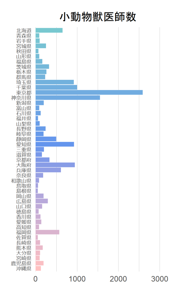
scale_y_continuous(limits=c(0,3000),expand = c(0, 0))の必要性:bar chartをggplotで作ると、0値の下にそれなりに大きい空間ができてしまいます。それを削除するために、この行が必要です。
theme内に大量のコメントアウトがありますが、設定を調整したいときにいちいち調べるのがめんどくさいので、必要なコードを全てコピペしています。使うやつだけコメントアウトをはずしています。
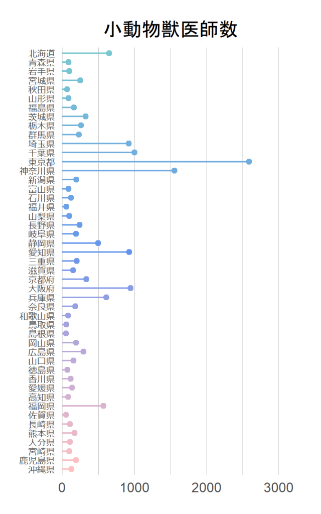
ロリポップグラフの作成方法
geom_segmentで飴の柄を作り、geom_pointで飴を作ります。
ggplot(df, aes(x=reorder(pref,n), y=smallanimalvet)) +
  geom_segment(aes(x=reorder(pref,n),
                    xend=reorder(pref,n),
                    y=0,
                    yend=smallanimalvet,
                    color=n)
                ) +
  geom_point(aes(color=n)) +
  scale_y_continuous(limits=c(0,3000),expand = c(0, 0))+
  coord_flip() +
  xlab("")+
  ylab("")+
  ggtitle("小動物獣医師数")+
  scale_color_gradient2(low = "rosybrown1",
                       mid = "cornflowerblue",
                       high = "darkslategray3",
                       midpoint = 25)+
  theme_minimal()+
  theme(legend.position = "none",
        plot.title = element_text(hjust = 0.5),
        axis.line=element_blank(),
        #axis.title.x = element_blank(),
        #axis.title.y = element_blank(),
        #axis.text.x = element_blank(),
        axis.text.y = element_text(size=6, family="meiryo", hjust=1),
        #axis.ticks.x = element_blank(),
        #axis.ticks.y = element_blank(),
        #panel.background = element_blank(),
        #panel.border = element_blank(),
        panel.grid.major.x = element_line( size=.1, color="grey" ),
        panel.grid.major.y = element_blank(),
        panel.grid.minor.x = element_line( size=.1, color="grey" ),
        #panel.grid.minor.y = element_line( size=.1, color="grey" ),
        plot.margin = unit(c(0.5,1,0,0), "cm")
  )
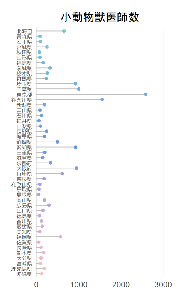
棒の色をグレーにしたもの
ggplot(df, aes(x=reorder(pref,n), y=smallanimalvet)) +
  geom_segment(aes(x=reorder(pref,n),
                   xend=reorder(pref,n),
                   y=0,
                   yend=smallanimalvet),
               color="grey") +
  geom_point(aes(color=n)) +
  scale_y_continuous(limits=c(0,3000),expand = c(0, 0))+
  coord_flip() +
  xlab("")+
  ylab("")+
  ggtitle("小動物獣医師数")+
  scale_color_gradient2(low = "rosybrown1",
                        mid = "cornflowerblue",
                        high = "darkslategray3",
                        midpoint = 25)+
  theme_minimal()+
  theme(legend.position = "none",
        plot.title = element_text(hjust = 0.5),
        axis.line=element_blank(),
        #axis.title.x = element_blank(),
        #axis.title.y = element_blank(),
        #axis.text.x = element_blank(),
        axis.text.y = element_text(size=6, family="meiryo", hjust=1),
        #axis.ticks.x = element_blank(),
        #axis.ticks.y = element_blank(),
        #panel.background = element_blank(),
        #panel.border = element_blank(),
        panel.grid.major.x = element_line( size=.1, color="grey" ),
        panel.grid.major.y = element_blank(),
        panel.grid.minor.x = element_line( size=.1, color="grey" ),
        #panel.grid.minor.y = element_line( size=.1, color="grey" ),
        plot.margin = unit(c(0.5,1,0,0), "cm")
  )
ハイライトの仕方
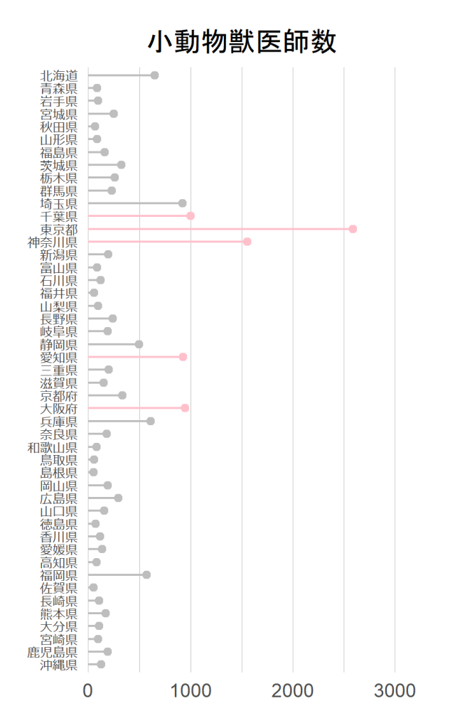
上記のように、ある項目だけハイライトしたいときがあるとおもいます。その場合には、ggplot内のcolor設定をifelseを使って条件分けすればできます。
ggplot(df, aes(x=reorder(pref,n), y=smallanimalvet)) +
  geom_segment(aes(x=reorder(pref,n),
                   xend=reorder(pref,n),
                   y=0,
                   yend=smallanimalvet,
                   color= ifelse(rank(smallanimalvet)>=43,"top5","others"))
  ) +
  geom_point(aes(color=ifelse(rank(smallanimalvet)>=43,"top5","others"))) +
  scale_y_continuous(limits=c(0,3000),expand = c(0, 0))+
  scale_color_manual(values =c("grey","pink"))+
  coord_flip() +
  xlab("")+
  ylab("")+
  ggtitle("小動物獣医師数")+
  theme_minimal()+
  theme(legend.position = "none",
        plot.title = element_text(hjust = 0.5),
        axis.line=element_blank(),
        #axis.title.x = element_blank(),
        #axis.title.y = element_blank(),
        #axis.text.x = element_blank(),
        axis.text.y = element_text(size=6, family="meiryo", hjust=1),
        #axis.ticks.x = element_blank(),
        #axis.ticks.y = element_blank(),
        #panel.background = element_blank(),
        #panel.border = element_blank(),
        panel.grid.major.x = element_line( size=.1, color="grey" ),
        panel.grid.major.y = element_blank(),
        panel.grid.minor.x = element_line( size=.1, color="grey" ),
        #panel.grid.minor.y = element_line( size=.1, color="grey" ),
        plot.margin = unit(c(0.5,1,0,0), "cm")
  )
おまけ plotlyでインタラクティブにする
fig <- ggplot(df, aes(x=reorder(pref,n), y=smallanimalvet)) +
  geom_segment(aes(x=reorder(pref,n),
                    xend=reorder(pref,n),
                    y=0,
                    yend=smallanimalvet,
                    color=n)
                ) +
  geom_point(aes(color=n)) +
  scale_y_continuous(limits=c(0,3000),expand = c(0, 0))+
  coord_flip() +
  xlab("")+
  ylab("")+
  ggtitle("小動物獣医師数")+
  scale_color_gradient2(low = "rosybrown1",
                       mid = "cornflowerblue",
                       high = "darkslategray3",
                       midpoint = 25)+
  theme_minimal()+
  theme(legend.position = "none",
        plot.title = element_text(hjust = 0.5),
        axis.line=element_blank(),
        #axis.title.x = element_blank(),
        #axis.title.y = element_blank(),
        #axis.text.x = element_blank(),
        axis.text.y = element_text(size=6, family="meiryo", hjust=1),
        #axis.ticks.x = element_blank(),
        #axis.ticks.y = element_blank(),
        #panel.background = element_blank(),
        #panel.border = element_blank(),
        panel.grid.major.x = element_line( size=.1, color="grey" ),
        panel.grid.major.y = element_blank(),
        panel.grid.minor.x = element_line( size=.1, color="grey" ),
        #panel.grid.minor.y = element_line( size=.1, color="grey" ),
        plot.margin = unit(c(0.5,1,0,0), "cm")
  )

### plotly
library(plotly)
fig <- ggplotly(g)
Sys.setenv("plotly_username"="あなたのusername")
Sys.setenv("plotly_api_key"="あなたのAPI")
api_create(fig, filename = "jyui")
ロリポップと似たグラフに、Cleveland’s dot plotがあります。