
変数が3つ以上あるとグラフ化できないので、傾向が見えずらくなります。そのため、PCAにて変数の数を減らし傾向を把握します。変数を減らすことの効用としては、わかりやすいのはBMIの計算があります。体重と身長の2変数を1変数にして、特徴をとらえやすくしています。
今回は、Rに付属されているデータのIRISを使います。花の150個のデータがあります。花の種類名も入っていますが、知らないことにします。花弁に関する4つの変数があります。これらのデータにPCAで傾向を把握することはできるでしょうか。
種名をとりのぞいたデータを作成します。
library(tidyverse)
iris_wo_label <- iris %>% select(-Species)
さっそく、PCAを実施します。prcomp(データ, scale = TRUE/FALSE)で実施できます。データの単位が異なる場合にはTRUE(相関行列)、同じ場合にはFALSE(分散共分散行列)を選択してください。今回は、すべてcmで計測されているのでFALSEです。(後記:TRUEのほうがよいようです。すべてcmで計測されているものの、数字が全て大きい変数(Sepal.Length:平均5.8)と、数字が全て小さい変数で(Petal.Width平均1.2)、影響力が変わってしまうので、やはり単位が同じといえど、スケーリングを実施すべきと勉強しました。)
pca <- prcomp(iris_wo_label, scale = F)
summary(pca)
summaryで、実行結果が見れます。cumulative proportionというのはその軸が変数の情報をどれだけ保持しているかという割合です。PC1というのは、第1軸です。PC2軸は第2軸です。第1軸が一番情報量の多い軸です。
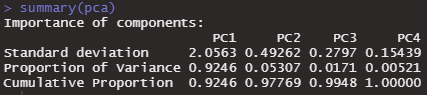
PC1→PC2→PC3→PC4と、情報を保持している割合が蓄積されていきます。もともと変数が4つなので、4軸を使えば情報が100%保持されているというのはわかりやすいですね。
軸のベクトルを知るには、pcr$rotationとすれば見ることができます。
pca$rotation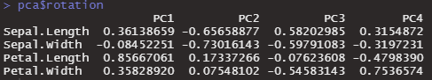
データごとに、第1主成分・第2主成分の数値を知るためには、pca$xとします。
pca$x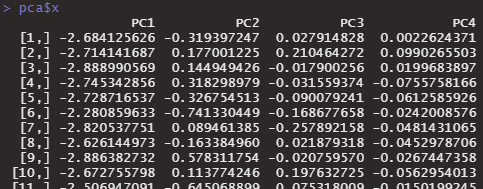
プロットするのは、biplot( )とするだけでできます。
biplot(pca)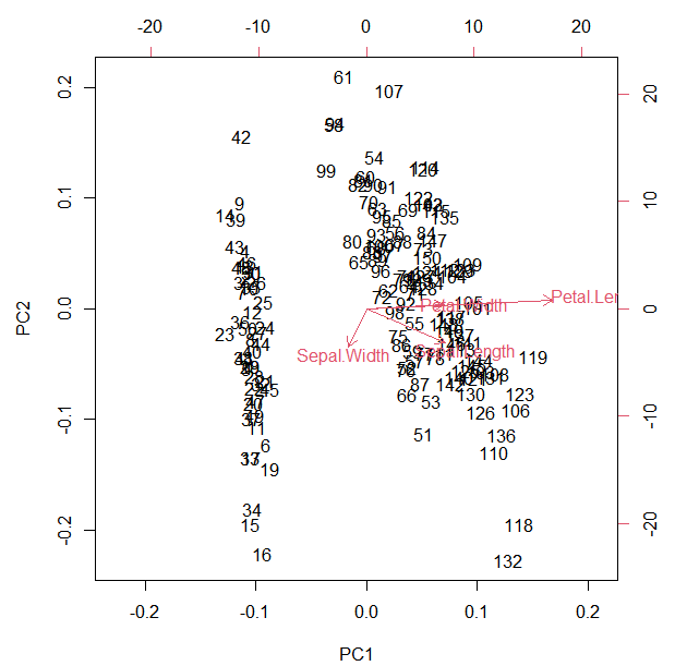
Petal.Lengthが長いものは右のほうへ、Sepal.WIdthが長いものは左のほうへ位置されているようです。なんとなく、2グループぐらいありそうな感じがします。
ラベルが数字なのがわかりずらいのでggplotで書き直します。
tibble(pc1 = pca$x[,1], pc2 = pca$x[,2]) %>%
  ggplot()+
  geom_point(aes(x=pc1,y=pc2,color=pc1))+
  scale_color_gradient(low="orange",high="purple")+
  theme_minimal()+
  theme(legend.position = "none")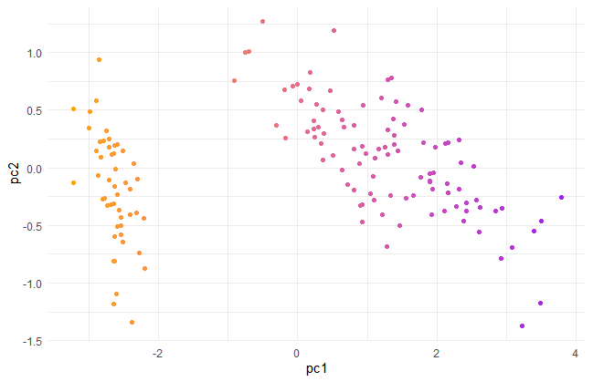
様々な方法でグループ化して、PCAのグループ把握能力を確かめてみます。
ところで、どこの軸までが重要かを測る指標があります。eigen valueというものです。これが1以下の軸は重要ではありません。変数1つの情報量より下だという意味のようです。
eigen_value <- pca$sdev^2
plot(eigen_value)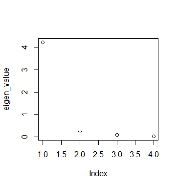
第2軸から重要じゃないみたいです。
K-means
何グループあるか分からないので、centers = 2グループ として実行してみます。
kmeans_obj <- kmeans(iris_wo_label,centers=2,nstart = 3)
pred_kmeans <- kmeans_obj$cluster

tibble(pc1 = pca$x[,1], pc2 = pca$x[,2],gr = pred_kmeans) %>%
  ggplot()+
  geom_point(aes(x=pc1,y=pc2,color=as.character(gr)))+
  theme_minimal()+
  labs(color = "Predicted Group")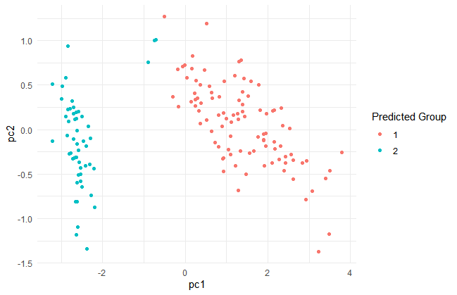
Hierarchical clustering
まずデータをdistance matrixにしないといけないです。
iris_wo_label_dist <- dist(iris_wo_label)
hierarchical <- hclust(iris_wo_label_dist,method = "complete")
plot(hierarchical)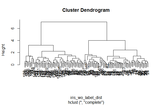
プロットを見ると、4グループあたりがちょうどよさそうな感じもしますが、2グループにします。cutreeで、枝が2つのところで木をきります。
pred_hierarchical <- cutree(hierarchical, k=2)

tibble(pc1 = pca$x[,1], pc2 = pca$x[,2], gr = pred_hierarchical) %>%
  ggplot()+
  geom_point(aes(x=pc1,y=pc2,color=as.character(gr)))+
  theme_minimal()+
  labs(color = "Predicted Group")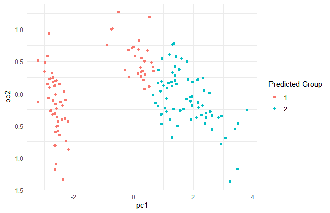
k-meansとhierarchical clusteringの2つのグラフを比べてみます。
library(patchwork)
g1<-tibble(pc1 = pca$x[,1], pc2 = pca$x[,2], gr = pred_kmeans)%>%
  ggplot()+
  geom_point(aes(x=pc1,y=pc2,color=as.character(gr)))+
  theme_minimal()+
  scale_color_manual(values = c("#98CA6F", "#E36D94"))+
  theme(legend.position = "none")+
  ggtitle("K means")
g2<-tibble(pc1 = pca$x[,1], pc2 = pca$x[,2], gr = pred_hierarchical) %>%
  ggplot()+
  geom_point(aes(x=pc1,y=pc2,color=as.character(gr)))+
  scale_color_manual(values = c("#E36D94","#98CA6F"))+
  theme_minimal()+
  theme(legend.position = "none")+ ggtitle("hierarchical clustering")
g1/g2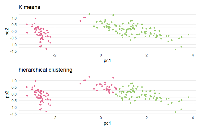
PCAの特徴能力把握能力は、なかなか高いものがありました。
ただ、色々なデータでPCAをやってみると変数が多いとわけがわからなかったり、cumulative proportionがPC1PC2で全然低かったりしてうまくいかないことも多々あります。