
statsmodelsか、、やり方調べないとな
pythonで回帰分析・logistic回帰分析をやろうと思うと、statsmodelsかsklearnが思いつきます。sklearnは機械学習に特化していて、coefとか取り出してもそっけなく数字が出てくるだけ。Rのように結果にびっしりと文字で丁寧に結果を表示してほしいです。それ、statsmodelsならできます。
regression
なんでもよかったけど、regressionのデータを持ってくる
from sklearn.datasets import load_diabetes
data = load_diabetes(as_frame=True)
df = data["frame"]
方法1 使う変数をマニュアルで設定することができる
import statsmodels.formula.api as smf
mod = smf.ols(formula="target ~ age + sex + bmi + bp + s1 + s2 + s3 + s4 + s5 + s6",
              data=df)
res = mod.fit()
print(res.summary())
OLS Regression Results
Dep. Variable: target R-squared: 0.518
Model: OLS Adj. R-squared: 0.507
Method: Least Squares F-statistic: 46.27
Date: Sun, 01 Jan 2023 Prob (F-statistic): 3.83e-62
Time: 23:16:44 Log-Likelihood: -2386.0
No. Observations: 442 AIC: 4794.
Df Residuals: 431 BIC: 4839.
Df Model: 10
Covariance Type: nonrobust
coef std err t P>|t| [0.025 0.975]
Intercept 152.1335 2.576 59.061 0.000 147.071 157.196
age -10.0122 59.749 -0.168 0.867 -127.448 107.424
sex -239.8191 61.222 -3.917 0.000 -360.151 -119.488
bmi 519.8398 66.534 7.813 0.000 389.069 650.610
bp 324.3904 65.422 4.958 0.000 195.805 452.976
s1 -792.1842 416.684 -1.901 0.058 -1611.169 26.801
s2 476.7458 339.035 1.406 0.160 -189.621 1143.113
s3 101.0446 212.533 0.475 0.635 -316.685 518.774
s4 177.0642 161.476 1.097 0.273 -140.313 494.442
s5 751.2793 171.902 4.370 0.000 413.409 1089.150
s6 67.6254 65.984 1.025 0.306 -62.065 197.316
Omnibus: 1.506 Durbin-Watson: 2.029
Prob(Omnibus): 0.471 Jarque-Bera (JB): 1.404
Skew: 0.017 Prob(JB): 0.496
Kurtosis: 2.726 Cond. No. 227.
Notes:
[1] Standard Errors assume that the covariance matrix of the errors is correctly specified.
きれいに表示されてないよねきっと。。
方法2 変数が多いときにこちらがおすすめ
import statsmodels.api as sm
y = df["target"]
x = df.drop("target", axis=1)
x = sm.add_constant(x)
mod = sm.OLS(y, x)
res = mod.fit()
print(res.summary())
結果はさきほどと同じです。add_constantでintercept用の変数を入れないと行けないというひと手間があります。けど、マニュアルで変数一つづつ書いていかなくていいというのはメリット。
logistic regression
とりあえず、classificationのデータセットを用意。
import statsmodels.api as sm
df = sm.datasets.spector.data.load_pandas().data
import statsmodels.formula.api as smf
logi = smf.glm(formula="GRADE ~ GPA + TUCE + PSI",
data=df,
family=sm.families.Binomial())
res = logi.fit()
print(res.summary())Generalized Linear Model Regression Results ============================================================================== Dep. Variable: GRADE No. Observations: 32 Model: GLM Df Residuals: 28 Model Family: Binomial Df Model: 3 Link Function: Logit Scale: 1.0000 Method: IRLS Log-Likelihood: -12.890 Date: Sun, 01 Jan 2023 Deviance: 25.779 Time: 23:22:03 Pearson chi2: 27.3 No. Iterations: 5 Pseudo R-squ. (CS): 0.3821 Covariance Type: nonrobust ============================================================================== coef std err z P>|z| [0.025 0.975] ------------------------------------------------------------------------------ Intercept -13.0213 4.931 -2.641 0.008 -22.686 -3.356 GPA 2.8261 1.263 2.238 0.025 0.351 5.301 TUCE 0.0952 0.142 0.672 0.501 -0.182 0.373 PSI 2.3787 1.065 2.234 0.025 0.292 4.465 =========================================================
こちらもうまく表示されていないはずです。あとで、その問題に取り組みます。
係数をodds ratioに変換
def transform_odds(res):
    import pandas as pd
    import numpy as np
    params = res.params
    params = np.exp(params)
    params = pd.DataFrame(params)
    conf = res.conf_int()
    conf = np.exp(conf)
    odds_dataframe = pd.concat([params, conf],
                               axis=1)
    odds_dataframe.columns = ["odds_ratio", "0.025", "0.975"]
    print(odds_dataframe)

transform_odds(res)
ダミー変数じゃない場合もodds ratioというかは知りませんが、連続変数が0のときと比べて変数が1のときにodds ratioがどうなるかわかります。
regressionの結果をフォーマットが崩れないように出力する方法
matplotlibで出力します。
def regression_result_to_img(dataframe, targetvariable):
    """This func creates a regression result as a image

    Args:
        dataframe (dataframe):
        targetvariable (string): target variable name in dataframe
    """

    import statsmodels.api as sm
    y = dataframe[targetvariable]
    x = dataframe.drop(targetvariable, axis=1)
    x = sm.add_constant(x)
    mod = sm.OLS(y, x)
    res = mod.fit()

    import matplotlib.pyplot as plt
    plt.rc("figure", figsize=(7, 10))
    plt.text(0.01, 0.05,
             str(res.summary2()),
                 {"fontsize": 10},
                 fontproperties="monospace")
    plt.axis("off")
    plt.tight_layout()
    plt.savefig("output_regression.png")

regression_result_to_img(dataframe = df,
                        targetvariable="target")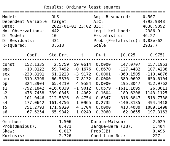
係数を見やすくプロットする方法
def plot_coef_of_regression(dataframe,targetvariable,xmin=0,xmax=0):
    """This func creates a regression result as a image

    Args:
        data (dataframe):
        targetvariable (string): target variable name in dataframe
        xmin (int): Adjust the xaxis of coef
        xmax (int): Adjust the xaxis of coef
    """

    import statsmodels.api as sm
    y = dataframe[targetvariable]
    x = dataframe.drop(targetvariable, axis=1)
    x = sm.add_constant(x)
    mod = sm.OLS(y, x)
    res = mod.fit()

    import pandas as pd
    conf = res.conf_int()
    conf["coef"] = res.params
    conf.columns= ["2.5%","97.5%","coef"]
    coef_df = pd.DataFrame(conf)
    coef_df["pvalues"]=res.pvalues
    coef_df["significant?"] = ["significant" if pval <= 0.05 else "not significant" for pval in res.pvalues]

    import matplotlib.pyplot as plt
    fig,ax = plt.subplots(nrows=1,
                        sharex=True,sharey=True,
                        figsize=(8,8))
    if xmin!=0 and xmax!=0:
        ax.set_xlim(xmin,xmax)
    for idx,row in coef_df.iloc[::-1].iterrows():
        ci=[[row["coef"] - row[::-1]["2.5%"]],[row["97.5%"] -row["coef"]]]
        if row["significant?"] == "significant":
            plt.errorbar(x=[row["coef"]],
                        y=[row.name],
                        xerr=ci,
                        ecolor="tab:cyan",
                        capsize=3,
                        linestyle="None",
                        linewidth=1,
                        marker="o",
                        markersize=5,
                        mfc="tab:cyan",
                        mec="tab:cyan")
        else:
            plt.errorbar(x=[row["coef"]],
                        y=[row.name],
                        xerr=ci,
                        ecolor="tab:grey",
                        capsize=3,
                        linestyle="None",
                        linewidth=1,
                        marker="o",
                        markersize=5,
                        mfc="tab:gray",
                        mec="tab:gray")
    plt.axvline(x=0 , linewidth=0.8,linestyle = "--", color = "black")
    plt.tick_params(axis="both", which = "major", labelsize = 8)
    plt.xlabel("Coeficient and 95% Confidence Interval", fontsize = 8)
    plt.tight_layout()

    plt.savefig("regression_coef_plot.png")
    plt.show()

plot_coef_of_regression(dataframe=df,
                targetvariable="target")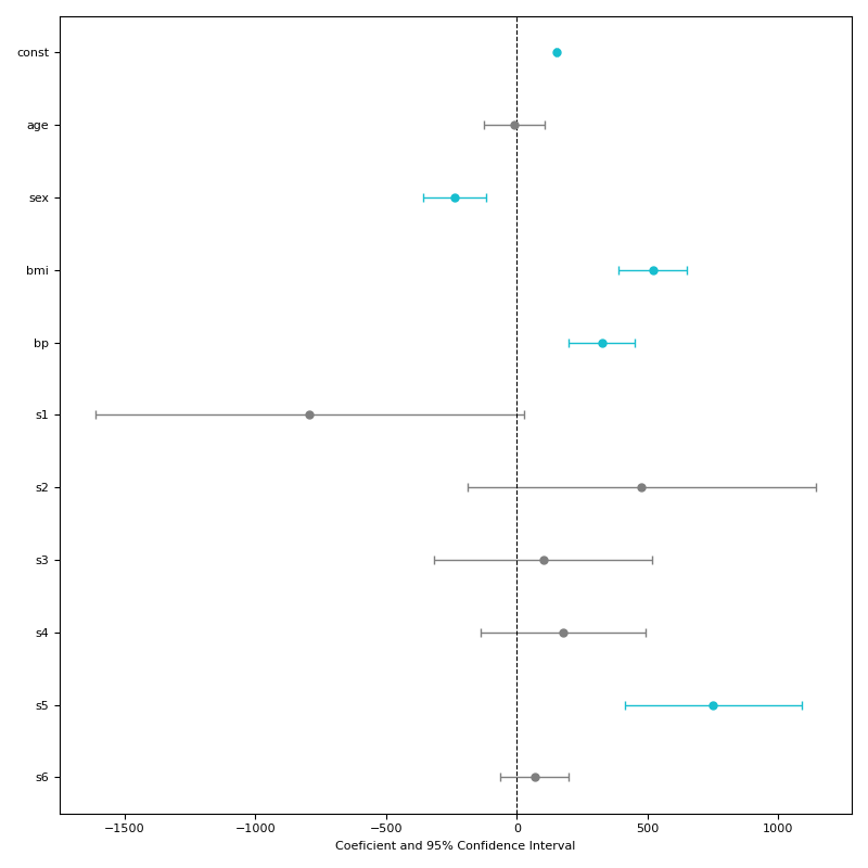
日本語が文字化けするときは以下のどちらかを使うことで解決します。
plt.rcParams['font.family'] = 'MS Gothic'

import japanize_matplotlib